Alibaba travels Co has been active in Iran’s travel and tourist business since January 2014 as a startup. Alibaba Travels Co. is the pioneer of online travel services in Iran. Our offices are located in Tehran. We are providing innovative, competitive and enjoyable services for the people who visit Iran and all Iranians traveling around the world.
At first we created a collaborativewhich our team members could add images gave them the feeling of what they expected to get from the product. It was a nice thing that got everyone involved in a visual activity. So we created a visual dream of what we wanted to build for our users.

User Research
I started out the research by conducting a Focus Group Test and Usability Testing to find out what are the main problems and current issues for booking a ticket in Alibaba.ir mobile apps. The on-site interview parts were: "SUS" (System Usability Scale) survey, Monitoring user behaviour through a defined funnel, A question list, and writing down users feedback about the product in general.
Here are the questions:
Why do you want to travel?
What's the first thing you do when you want go to travelling?
How many times do you travel in a year?
Do you travel for business or other purposes?
What’s your Favourite apps to booking travel?
What's the benefit of booking online instead of physically buying?
What does bother you when book ticket?
Do you have any suggestions for improving the product?
14 users from a targeted group selected from behaviour variations (price-sensitive, quality oriented, planner, random purchaser and etc) which we had their data already, were asked to come over and do the on-sight product test and an interview. At the time another super app added travel ticket booking to their products with a permanent discount which gained a considerable market share. We needed to create an added value to compete and increase the conversion rate on Alibaba.ir application. Mainly all they needed were:
Offers and deals
Personalisation
Reasonable Price with being able to compare
After the exploration part and searching about the target user behaviours, it was time to shape all the information we collected during the interviews. We build a representative user, which tells us about a group of users, with the same behaviours. This effective tool to define the user's descriptive model.

Our Pesona is Ali, who likes to travel with his wife or with a group. He has a stable job with a good income, also he's price sensitive and browse a lot to keep himself updated about the average fee of the market. Let's find out more about his feelings towards our existing product.
Here is an Empathy map and the things we found out about Ali's emotions and behaviours.

User Journey map
In this step I want to know how the user would interact with product(when user wants to book flight ticket). I define 5 stage :
Choosing the destination:
This is when user is thinking about somewhere to go for upcoming vacations.
Choosing best way to get there:
This is the step when user doesn't know which transportation is more reasonable to get to the destination.
Searching for tickets:
This is when user checks for the available tickets list.
Booking Ticket:
This is when user has been confident with the Final selection and booking is about to complete.

Based on the User Journey I found out user needs these options and it might turn the user to customer!
I need to have recommendation on destinations.
I should check other apps to find out about deals and offers and best prices.
I can’t compare transportation option to see which one works for me.
I need to have the option of booking transportation+accommodation with good deal.
And here is opportunity to gain their paint points :
Creating a dynamic homepage filled with recommendation and offers both general and personalized. Putting a comparison option preview in each available list. Suggest discount on bundle booking (transportation+accommodation) and show them in available lists. Run an A/B test to check if the "Login" works better in the beginning of the funnel.
After the research part and finding out what we need to optimize, the plan was to have a project consists of new design for some features, improving the current design and change the part which already causes pain for the users ( Like the date picker). So me Hamed (my teammate) started to benchmark other travel businesses to have the big picture of where we are now. Wireframing and present them to our squad team to discuss their idea over project were the next phase. We went for designing wireframes in sketch then make a prototype, afterward testing the prototype with other squads and gathered all the feedbacks to changes what we didn't consider before was on the plan. From the first steps while we started to design, we created the UI kit for each component.
You can checkout the final design system here:Alibaba.ir mobile application design system.
.jpg)


For the first step of "Personalization" process in application, we added a dynamic homepage in which provides various offers, deals and promotions. and for the next step which is smarter, based on users previous searches it recommends related offers and give promotions to each cluster of targeted users.
Here is the new design of app homepage in English and Persian languages:

Based on the users feedback before, we decided to create a new type of deal which made of two businesses together with an amount of discount. In the first step we promoted the Hotel+Train packages to promote our hotel providers and also make the process easier for the users. The design solution was to design a different item which is noticeable and looks like a deal. So I became with a carousel card view at the top of train available list which has a "Special Offer" badge at the corner.

For comparing the price of same route with different transportation options, we came up with showing the prices of two other transport options at the top of the Available list. Here is the available list for a route with flight, two other options are train and bus ticket prices.

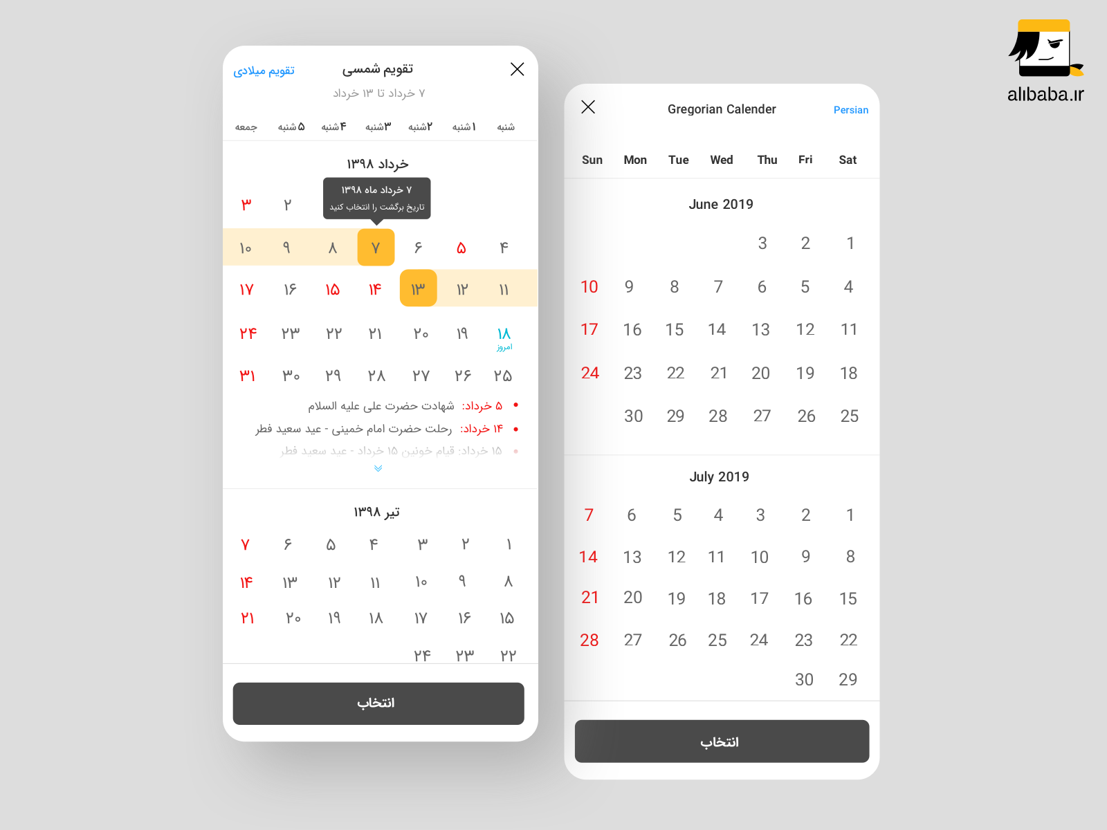
Some improvement was like making the Date Picker more user-friendly and smooth. It opened on a Dialog before which was hard to interact with. Also the "Cancel" "Gregorian" and "Choose" Buttons were in the same color which cause misusing them a lot! So I designed a clean and simple version of Date Picker with close button on the top corner (in order to reduce unintentional touch) and an obvious "Choose" Button down the component.
Here you can see the old and redesigned version of Date Picker at the pictures:


The goal for this project was to create a dynamic homepage for Alibaba Travel App, which users can get offers and promotions based on their activities. And also optimize the funnels and remove the pain-points of users through their experience. We went through all the stages using design thinking and UX tools. All this process helped us create a meaningful product for our users, which resolves pains during the travel experience and helps them to achieve their goals. As a team, we realized the importance of developing a product with a user centered approach. We also learned the power of testing ideas in the first stages of the process, to validate our product before the development.
If you like what you see and want to work together, get in touch!
elhamsalemian90@gmail.com